
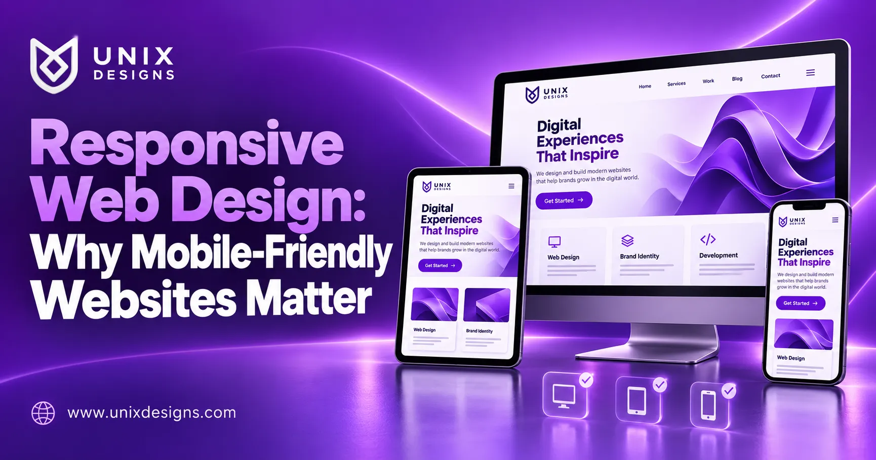
Responsive web design helps your website adapt to the screen someone is using, whether that is a phone, tablet, or desktop computer. For business owners, the benefit is practical: customers can read your information, explore your services, and contact you without struggling with the layout.
Imagine someone opening your website after seeing a Facebook advertisement. The text looks tiny, the menu covers the screen, and the enquiry button disappears below an oversized image. Even an interested customer may leave. A mobile-friendly website removes those obstacles and gives visitors a clearer path from curiosity to enquiry.

What Is Responsive Web Design?
Responsive web design uses flexible layouts, adaptable images, and styling rules to present a website appropriately across screen sizes. A row of three service cards on a desktop might become a single column on a phone.
The aim is to make the content comfortable to use wherever it appears. Navigation may change, spacing may adjust, and buttons may move into more convenient positions.
Google describes responsive design as serving the same HTML and URL across devices while adjusting the presentation for the screen. It recommends this approach because it is easier to implement and maintain. developers.google.com
Why Mobile-Friendly Websites Matter for Sri Lankan Businesses
Customers can discover your business through search results, social media, WhatsApp links, or a recommendation from a friend. Those visits may happen while travelling, comparing suppliers, or checking details outside business hours.
A resort visitor might want room photographs and availability information. A construction customer may need examples of completed projects. Someone browsing a shop may want a price or delivery details.
Your website should support these tasks on a smaller screen. This matters whether you serve customers in Jaffna, Colombo, Kandy, or overseas. The device should not determine whether someone can understand your business.
How Responsive Web Design Improves Customer Experience
A good mobile experience makes everyday actions feel straightforward. Visitors should know where they are, what you offer, and how to continue.
Readable Text and Comfortable Spacing
Customers should be able to read paragraphs without repeatedly zooming. Headings need a clear hierarchy, while line lengths and spacing should make longer pages comfortable to follow.
Avoid squeezing desktop content into narrow columns. A service description is more useful when it remains readable than when every element stays in its original position.
Navigation That Works with Touch
Mobile menus need clear labels and reliable controls. Buttons should have enough space around them to reduce accidental taps.
Check whether visitors can open submenus, close overlays, and return to previous sections easily. A menu that looks attractive in a screenshot may still be awkward when used with one hand.
Forms That Are Easy to Complete
Keep enquiry forms focused. Ask for the details your team needs to respond, and use clear labels rather than relying entirely on disappearing placeholder text.
Test the experience with the phone keyboard open. Customers should still be able to reach the submit button and understand any error messages.
Responsive Web Design and SEO: What Is the Connection?
Google uses the mobile version of a website’s content for indexing and ranking. Its mobile-first indexing guidance therefore makes mobile content an important consideration during development. developers.google.com
Your mobile pages should retain the important information, headings, links, and descriptive content available to desktop visitors. Hiding useful service information simply to shorten the mobile layout can weaken the experience.
However, responsive web design does not guarantee high rankings. Helpful content, clear page structure, relevant titles, and reliable technical implementation still matter. Treat mobile usability as part of a broader SEO plan.
Mobile Layout and Loading Speed Need Separate Attention
A website can fit a phone screen and still load slowly. Large images, unnecessary scripts, background videos, and third-party tools can make an otherwise tidy page frustrating.
Ask your developer to review both layout and performance. Images should be appropriately sized, and essential content should not depend on heavy decorative effects.
Test service pages, galleries, and forms as well as the homepage. A customer may arrive directly on a product page from a shared link.
Performance checks should reflect realistic browsing conditions. A page that feels quick on an office connection may behave differently on a slower mobile network.
Make the Next Step Clear on Every Screen
Your website should help interested visitors act. Depending on your business, that action might be requesting a quotation, calling the office, checking products, or sending a booking enquiry.
Place the main action where it makes sense within the page. Use specific labels such as “Request a Quote” or “Ask About Availability.”
WhatsApp buttons and fixed contact bars can be useful, but they should not cover text, form controls, or important navigation. Test them alongside cookie notices and other overlays.
The goal is a convenient next step that remains available without interrupting the information customers came to read.
Common Mobile Website Problems to Avoid
Several small layout issues can make a website harder to use:
- Images or tables extending beyond the screen.
- Text placed over backgrounds with poor contrast.
- Menus that fail to close after selection.
- Pop-ups that hide the close button.
- Important features available only through mouse hover.
- Contact forms with inaccessible submission controls.
Also check language versions carefully. Sinhala, Tamil, and English text can occupy different amounts of space.
Address these problems during development and review them after major content changes. A new heading or uploaded image can expose weaknesses in an otherwise working layout.
How to Check Your Website on Mobile
Start by using your own website as a customer would. Open a service page, browse photographs, find contact details, and send a test enquiry.
Try more than one screen size and browser where possible. Rotate the phone, open the keyboard, and check longer pages.
A Practical Responsive Web Design Review
Ask a colleague unfamiliar with the website to complete a simple task, such as requesting a quotation. Watch where they hesitate.
Their experience can reveal unclear labels or hidden controls that the project team has stopped noticing. Record specific problems so your developer can reproduce and fix them.
Planning a Mobile-Friendly Website with Unix Designs
Unix Designs provides website development, SEO, e-commerce solutions, and ongoing website support. Explore our web design and development services to discuss your requirements. Unix Designs
Before starting, identify the tasks customers need to complete. Prioritise readable content, straightforward navigation, reliable contact options, and a manageable maintenance plan.
Browse our completed website projects and review our website packages for a starting point.
Whether you need a new website or improvements to an existing one, responsive web design should support your customers’ everyday needs. Contact Unix Designs to discuss a website that works comfortably across devices.